How I Got My Logo
I set out early in life to make the world more beautiful with my paintings and drawings. I was energetic, idealistic and committed. After grad school in Boston and stints in ateliers in Paris, New York and the San Francisco Bay Area, I set up shop on a family farm in rural North Carolina and made a bunch of stuff – year after year – largely in isolation – exhibiting often – selling infrequently. As is often the case, things didn’t go according to plan. Life didn’t deliver on what I had thought I had bargained for: Doesn’t hard-work, vision, talent, perseverance and moderate financial backing equal success? Instead of realizing my dreams, I closed up shop, started a family and took a string of salaried jobs. Though that life fulfilled many of my desires, at this crossroads, I am taking a new leap of faith. I am launching this website and blog in conjunction with a return to the artistic life. I got a shop at Golden Belt Studios in Durham, North Carolina in December of 2021. I left a corporate job in cybersecurity sales where I managed the company’s global sports sponsorship program. And now, I get to draw to my heart’s content – hour after hour – day after day – well, that is, if you would be kind enough to buy one of my pictures and hang it in your home or office.
To inaugurate this new chapter and with everyone saying that I had to have a social media presence, I, at first, wanted a brand identity that was elegant and refined. I am not much of a car guy, and I don’t love-love the part of American culture whereby a vehicle is believed to express something innate and genuine about its driver, but the Audi a8, which I can’t really afford, seemed a befitting automobile for this stage of my life. It boasts subtle, sleek, strong but not very sporty styling and design for a sedan. Yet, despite looking a touch banal on the surface, the a8 is powerful under the hood. Basically, the masculine version of elegant and refined! So, when I approached my friend, Alison Wadell at Moonlit Designs, up in Pennsylvania, to help me come up with a logo, I gave her those words as a starting point – elegant and refined. It also seemed to fit the portion of my portfolio that I was going to market with: traditional black-and-white drawings with a modern flare (FYI: I make all kinds of shit: egg tempera and gold-leaf on panel religious icons, abstract oils on canvas, silkscreens of concepts of animals, woodblock erotica, etc.). I also fed her the notion of transforming my initials “N” and “H” into Japanese kanji in a brush-stroke motif as if they were hand painted. It was going to be like the Peloton “P” or the Meetup “M.” Alison’s work was great, but it didn’t set any of our hearts on fire. (For the record, I don’t drive an Audi a8.)
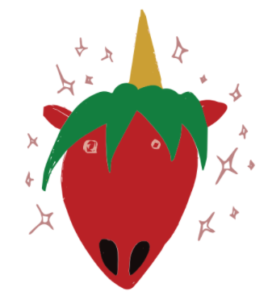
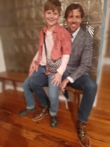
Enter: My son, Atticus. Age 12 – going on 4 and 44. I was a foster-parent for a while, but he is my only biological child. Let’s be upfront and clear about this: He is way cooler than me. When I was fresh out of seminary at Duke University and singing him to sleep at the tender age of 4 with Methodist hymns, I remember him putting on headphones and listening to Eminem for hours after bedtime. For years, he has had long-bleached hair and pierced ears. His hobbies aren’t the standard fare for boys (football, soccer, basketball). No, my child loves hip-hop dance, martial arts and horseback riding. He loves volunteering in the adoption department at a local animal shelter. The point is this: He is just dope. He has always marched to his own drum-beat. And, he has been an avid drawer since a young age – which brings me boundless pleasure. For several years, he has made these mesmerizingly detailed and creepy friezes of alien invasions, Star Wars battles and zombie apocalypses. On a recent trip to Texas to see extended family, his mother, after giving a crit of one of his standard fares on the airplane, pleaded with him to make “something nice.” He bargained with her that if he made a “nice” drawing that he could spend the rest of the plane ride making his more “creepy” variety. She consented. And, the “unicorn strawberry” was the result.
Now, I will not be the first father to celebrate the work of his offspring – and to try to elevate that child’s efforts to a podium they don’t deserve to be on (see, nepotism). But, isn’t this thing adorable? Pure magic, even? I love the seed berries around the nostrils. I love the pink stars around the head – like a collision from an old Tom & Jerry cartoon. I love how the green ears and horn at first appear to be the strawberry’s leaves. His original concept has a raw exuberance and creative vitality that is delightful and irrepressible. It shines a light that seems hard to extinguish. In a word, it is the perfect portrait of my dynamic and complex boy. Looking at it makes me smile, and occasionally it makes me laugh out loud. In this season of my life (maybe partially explained later), I need as much humor, good vibes and positivity as I can muster.
So, in any event, I said to myself: “If I had that as my logo, I would want to come to work every day.” And, that was that.
In short order, I asked Atticus for permission to use it. He said, “Yes.” But, we are still in negotiations to determine what fair compensation will be. I’ll keep you posted when the contract is signed.
I hope that as you journey with me through this new phase of self-discovery in the studio, the logo for “The Nate Hester Studio: Pretty Sketchy” brings you at least some of the warmth and joy that it brings me. And, until we connect next week, delight in the world; exchange love with those around you; and, above all, awaken more and more to your own awesomeness.


